A market priced for perfection [Week #30]
Forecasted EPS NTM are soaring for the S&P500, what does it mean when analysts are so bullish?

Welcome back to another Macro Update, before diving into the macro dashboard, I wanted to run a quick study on the EPS NTM.
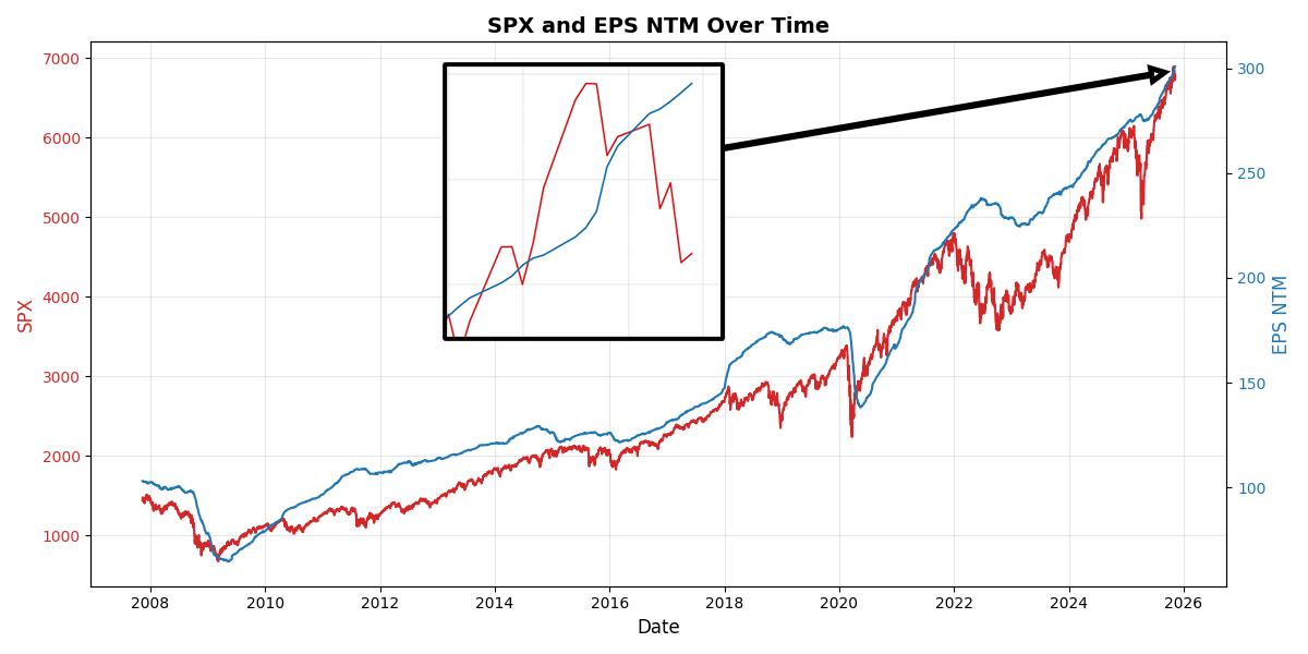
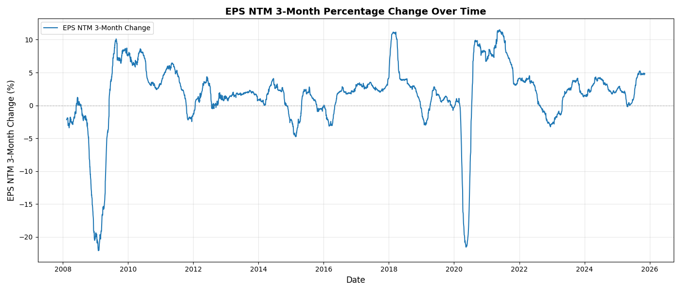
The recent jump in the EPS NTM estimates has really caught my attention. Such a jump is not so common when the index is trading within a few percentage points from the all-time high. The EPS 3-month rate of change is sitting at +5%, which is a high reading given we did not go through an earnings trough like during COVID or the GFC. The other notable exception was in January 2018 when a certain Donald Trump took office. History doesn’t repeat but it rhymes, doesn’t it? This time, however, analysts’ forecasts are a little bit less silly.
Tracking the NTM EPS is part of our process when refreshing the weekly macro dashboard. But it is important to take some time and reflect on its value. First of all, how is it constructed?
The S&P 500 bottom-up NTM EPS aggregates consensus analyst forecasts for the index’s 500 companies over the next rolling 12 months. It’s built by: (1) collecting individual company NTM EPS estimates, (2) forming consensuses, (3) calculating total earnings via shares outstanding, (4) summing across companies, and (5) dividing by the index divisor for a weighted average. This forward metric aids valuations like P/E ratios and is updated frequently by providers like Bloomberg.
It is a powerful way of building a forecast because it doesn’t rely on a handful of analysts. Instead, it relies on hundreds and thousands of analysts each building their own forecast model.
The core concept at play is the law of large numbers. While one analyst’s forecast might be completely off, by averaging all the forecasts out there, we obtain an estimate very close to its true value. You probably got introduced to this concept earlier in your life with the jelly bean jar experiment. It never fails to amaze me. There is wisdom in the crowd and comfort in using large samples.
This intuition has been confirmed by many research papers. It is well documented that forward P/E is generally superior, as it incorporates analyst forecasts and better anticipates long-term growth.
But it comes with a caveat: forward earnings are often biased toward optimism in uncertain stocks, especially growth stocks with a great narrative. After all, analysts are real people, and they too can be influenced. That influence could come from their workplace where a culture fosters aggressive bets on growth stocks (think a SoftBank analyst). It could also come from their personal background; a tech enthusiast will translate their wild expectations through inflated earnings.
On average, all these behavioral biases are balanced out at the index level. The forward EPS estimate on the S&P should be free of all bias. Or at least that’s the theory. Remember, the law of large numbers states that given a sample of independent and identically distributed values, the sample mean converges to the true mean.
Read that twice, a sample of independent (and identically distributed) values.
Now I am asking you: how can anyone be fully independent in a world where everyone is overconnected and subject to constant information overload from the media and social networks? We all consume pretty much the same information, repackaged differently depending on the media, but never as a crowd have we been so connected. This is especially true for a subsample like banks’ analysts. They listen to the same podcasts, follow the same accounts on X, go to the same bars in NYC, London, or Hong Kong. They all live to some degree the same corporate life. These people are not fully independent, and they are subject like any crowd to the fallacy of herd thinking and trend following.
To confirm my intuition, I built the Analyst Sentiment Oscillator below. It is built from the rolling rate of change of the EPS NTM over different windows. It gives a good insight into how optimistic or pessimistic analysts are. This is not a perfect measure by any means, but it does the job: telling us when all the analysts are on the same side of the boat.
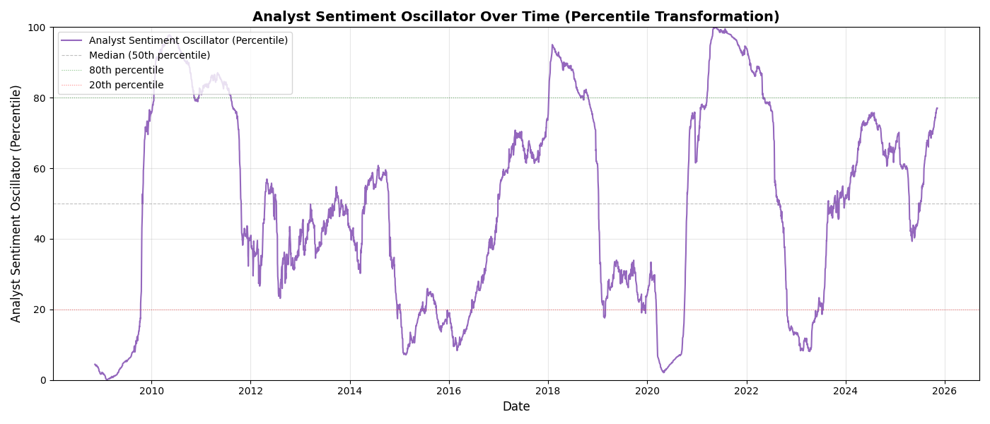
This chart makes it very easy to read the fear and greed cycle over the last 18 years:
Ground Zero: 2008 during the GFC
The burst of optimism following the GFC and well into 2010 but met by a sharp trip back to neutral in 2011 during the sovereign debt crisis.
2018: very high reading following Trump’s first mandate
Extreme pessimism in 2020 with COVID
Extreme optimism in 2021 with the meme mania and the great reopening
2023 trough with the great hiking cycle from the Fed
High bullishness at the end of 2024 with again, Trump.
And critically, the index is now sitting right below 80%, a very high reading and indicative of extreme optimism.
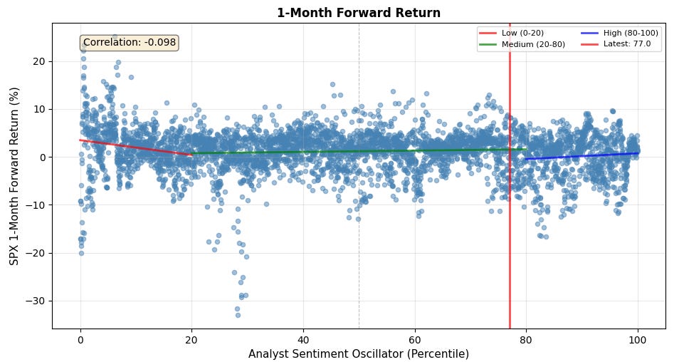
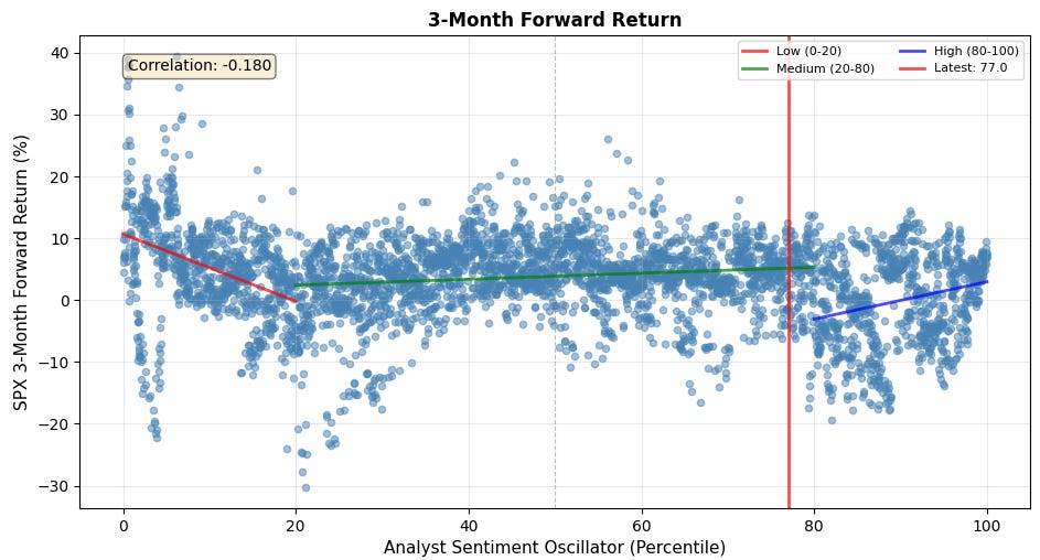
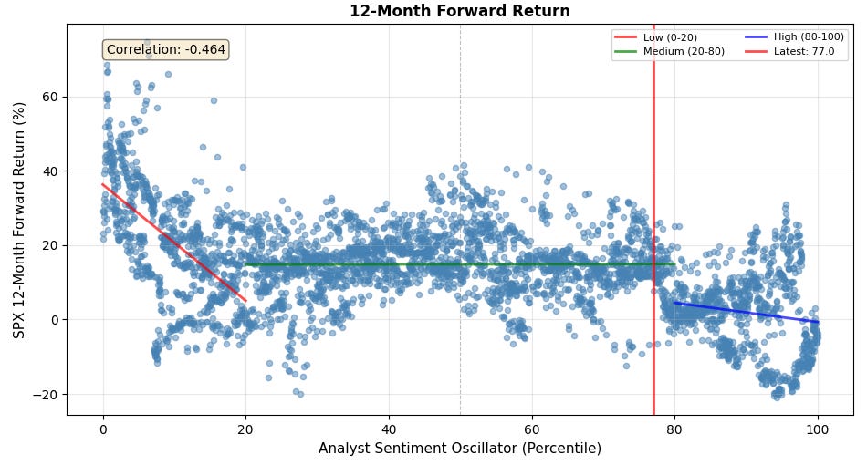
In order to understand the potential for any alpha, I looked at different S&P500 forward returns against the oscillator reading. Using a threshold of 20 and 80 is a favorite of mine, and because the alpha lies in the extremes, you will see 3 regression lines: one for the data with a Sentiment reading in the range [0, 20] (max pessimism), another one for the range [20, 80] (neutral), and one for the range [80, 100]. Below are my findings,
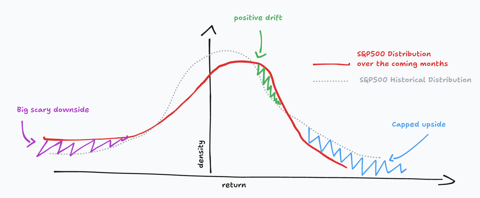
1-month forward return: fading the extreme pessimism is a risky bet but on average it is extremely rewarding. In a neutral reading (between 20 and 80), the returns look normally distributed; this is expected as most of the data lives in there. In a very optimistic environment, with a reading above 80, the distribution has changed: the median return is positive, but the average return is poor, and there is more volatility on the downside. Finally the upside looks capped. This is typical of a market “priced for perfection”.
The 3-month forward is a bit of the same but more pronounced.
The 12-month forward is really interesting. It is telling you to fade the analyst sentiment oscillator on any low or high reading. Buy when they are pessimistic, sell when they are overly optimistic.
If there is one thing you should remember for this week, it is this: the market is priced for perfection. The expected distribution for the S&P500 returns is one with deeply negative skew but a positive median return, and capped upside.
Yes, this is the same distribution as a high-yield bond, and that’s exactly how you should picture the S&P500 right now.