
Introducing the Macro Dashboard
A weekly guide to the market

The Market Hitchhiker is very excited to share his Macro Dashboard with you. Navigating the market is difficult and overwhelming when you don’t know where to look at. May this dashboard serve as a North Star for you in your trading and investing decisions.
Plus, you will sound smart when people ask your opinion about the market!

Of course I had to start with a meme…
But now let’s get into the meat of it!
Since this is the first time I am sharing this dashboard with you, I will go through an explainer of each category and item. In a nutshell, this dashboard should be used as a map for your trading and investment. It gives you a ten thousand foot view of the US market by looking at macro indicators (quantitative & qualitative). Such situational awareness is critical when assessing potential opportunities and risks arising on the market. It will be updated weekly as part of a weekly recap post where I will share updates on this dashboard, but also updates on the market, upcoming & past events, and my trades.
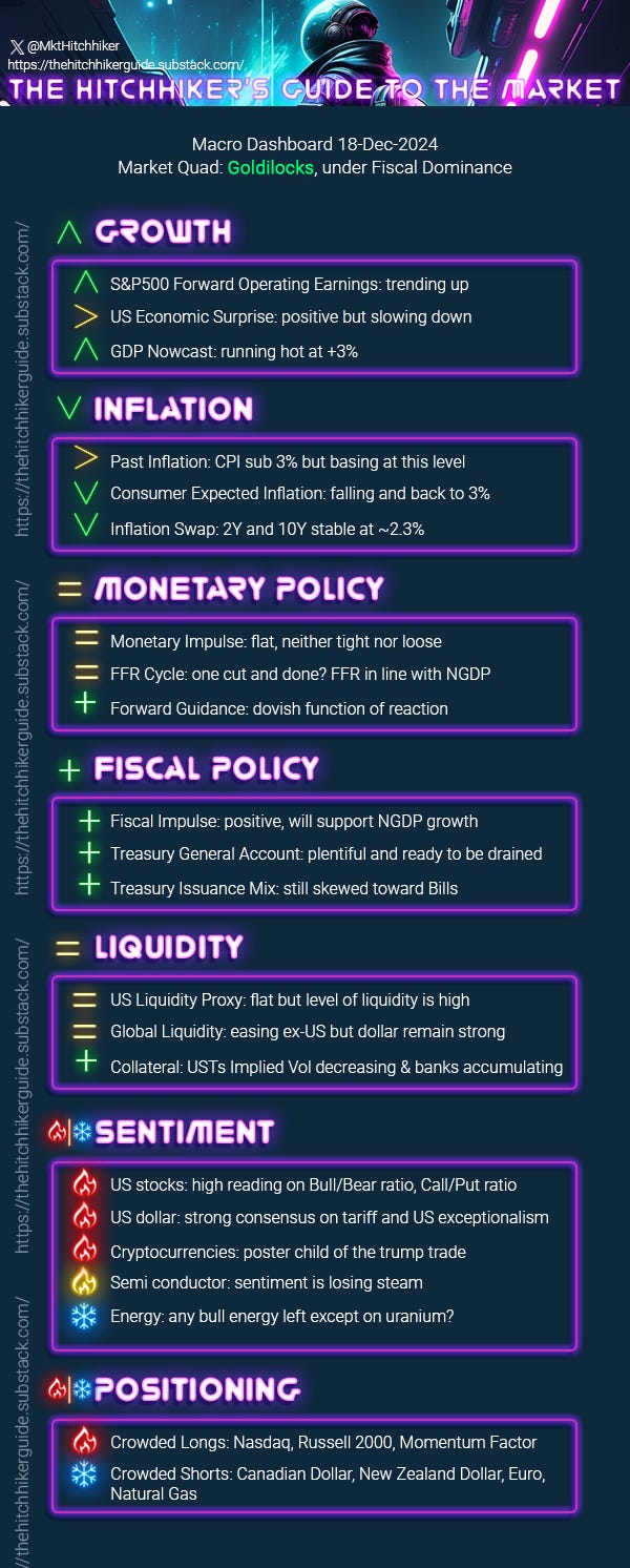
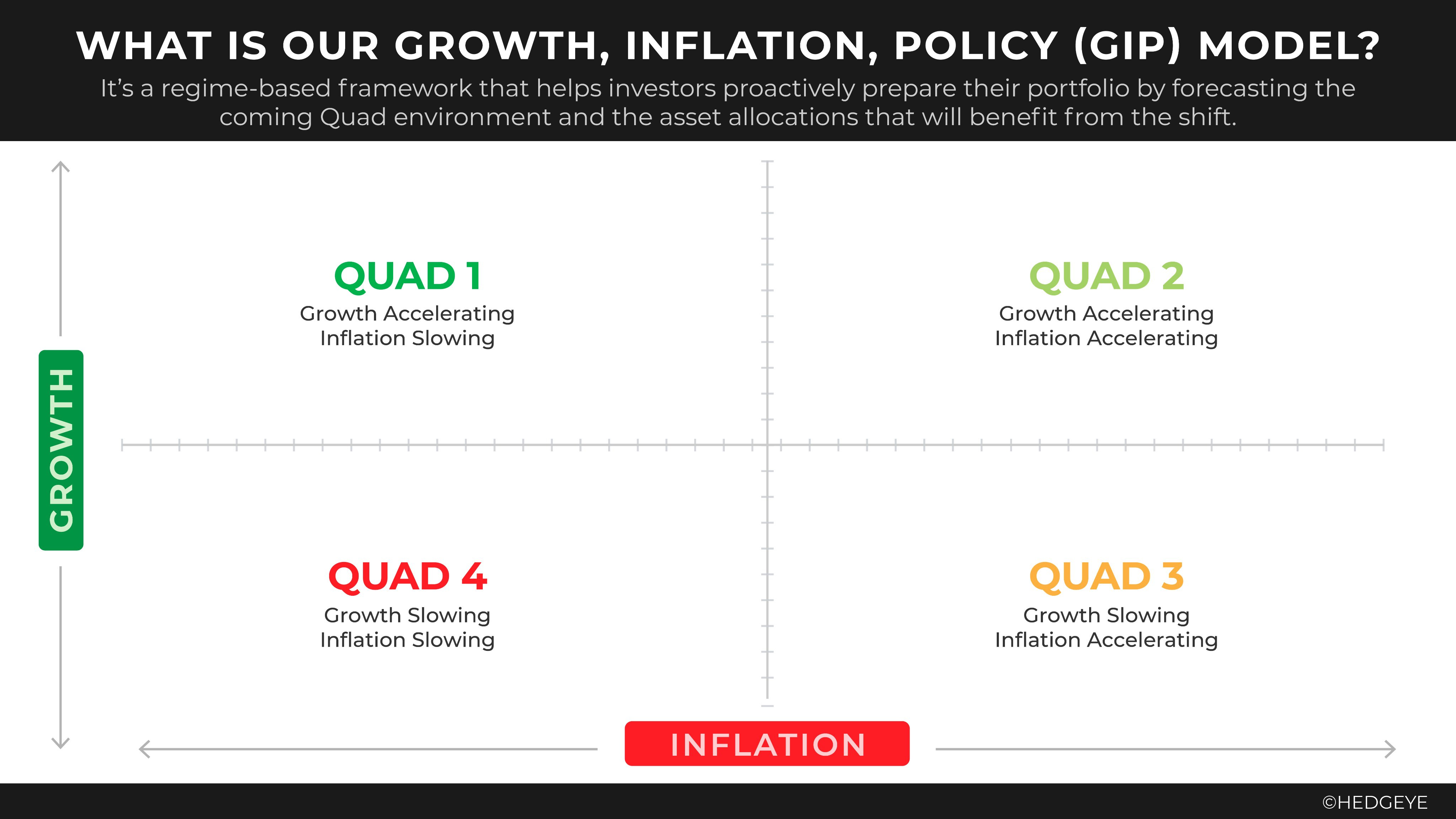
At the very beginning of this dashboard you will see my assessment of the current market state: the “quad” and the monetary/fiscal dominance. This conclusion has a very important impact on my trading, and my view of the market. Each decision I make and each opinion I build is framed by the quad and the dominance. The market is my real time feedback to this dashboard: is the market price action agreeing with the quad? If not, I need to understand if either the quad is turning or if the market is temporarily wrong and presents a tactical trade.
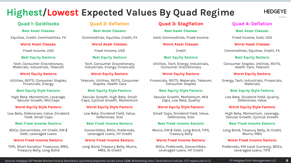
I will write a dedicated post on the below 4 quads at a later time, and how to trade and invest during each one. For now you can use the below tables from Hedgeye, it’s a bit outdated but it’s a good starting point.
To estimate the current growth of the US Economy, I am looking at three items:
S&P500 Forward Operating Earnings: this time series is updated weekly, and gives a consolidated view of the expected corporate profits. As of today, forward earnings are trending up as analysts are very bullish for 2025 (too bullish?).
US Economic Surprise: this is a daily time series calculated by Citi. A strong trend in the market is fuelled by positive economic surprises. The US 10-year yield tends to trade in sync with this time series. After a growth scare this summer, we now have a positive reading, but the velocity of the positive surprise is now declining.
GDP Nowcast: the Federal Reserve Bank of Atlanta provides a weekly estimate of the US GDP (in nominal term). This is our anchor to the “real economy”. The last estimate was 3.1%, this is still a strong economy.
The second category is inflation. This one is pretty straightforward but I will go through a brief description of each item:
CPI: do I even need to introduce this guy? Inflation is looking sticky right now, finding a new base at 3%. However three major inflation vectors are slowing down: shelter, labor and oil. I do believe we will see stable inflation next year (despite the consensus of high inflation because of Trump and tariffs, etc).
Consumer Expected Inflation: there are a few surveys available where consumers are asked for their expected inflation 1 to 5 years ahead. Inflation is kind of difficult to model, some will say impossible. At some time it is mean reverting, while other times it’s a trending process. The anchoring of inflation at different timeframes is what drives these two states: either expectations are unanchored and inflation is trending, or expectations are anchored and inflation will revert to it. At the moment, consumer expectations are mean reverting to their long term value.
Inflation Swap: this is where the market is pricing forward inflation from 1-year to 10-years. In the past two weeks inflation swaps are a bit higher but we are overall in a stable down trend. 1yr pricing at 2.65% CPI, and 10yr pricing at 2.4%. Very well behaved.
Monetary Policy is the third category:
Monetary Impulse: we are looking at the change in M2, but adjusted by the regulatory reserves held by the banks and some other technical adjustments. The transmission of monetary policy through credit channels suggests that changes in monetary policy directly affect credit availability. For instance, when a central bank implements a positive monetary impulse, it can lead to increased lending from banks, thus loosening credit conditions. A positive monetary impulse is therefore positive for NGDP and for risk asset prices.
Easing Cycle: where do we stand in the Fed Fund Rate easing cycle? As of today my view is one cut for today’s FOMC and 0 for 2025. The market is pricing somewhere between 2 and 3 cuts in 2025. But it’s a weighted probability of all the scenarios, meaning the most likely outcome priced by the market is actually 0 cut. The extra cuts priced in are coming from the left tail of the distribution. If there is a market crash, they will have to cut something like 10 times or more. The median scenario, which is the bullish risk asset scenario, is 0 cut and 0 hike in 2025. I used an equal sign in the dashboard, meaning I am neutral on the impact of the cycle regarding risky assets performance, but it’s somehow bullish as the volatility on the bonds will keep decreasing.
Forward Guidance: the FED’s function of reaction has been dovish since Powell pivoted at the end of 2023. It has remained dovish ever since then. We will need to carefully watch the FOMC tonight to see if any changes in Powell’s tone is transpiring. In my opinion the FED put is well alive, and the cushion is high with a 4.25% fed fund rate.
Fiscal policy has been center stage since covid. Its effect has taken over the monetary policy, especially in 2022. This is when the Fed started tapering, but the US Treasury offset all of it with a positive fiscal impulse.
Fiscal Impulse: it’s merely the difference between the US Treasury outlays and the receipts (i.e. spending minus tax). To increase the impulse, the government can decide to spend more, or lower the tax. It has a direct effect on the inflation by supporting or destroying the domestic demand for products and services, but it has little effect on the supply side.
Treasury General Account: it’s the US government bank checking account. It gets refilled through tax collection and issuance of treasuries. When it goes up liquidity is drained out of the system. When it goes down, it has a positive impact on liquidity and the market.
Treasury Issuance Mix: the US Treasury can select the duration when issuing debt. The debt issued is either a bill for short term duration (below 2 years) or a bond for longer duration. Changing the mix between Bills and Bonds is technically just an asset-swap operation, meaning it doesn’t change the total liquidity in the system. However it has practical consequences on the yield curve, they can effectively suppress the yield in the back-end by issuing more bills over bonds.
The concept of what is liquidity is very debatable, there are different schools of thought on how to measure it. I have decided to use the most popular metrics:
US Liquidity Proxy: this is equal to FED BS - RRP - TGA. It has its limitation but every investor is now looking at it.
Global Liquidity: we are looking at the sum of all the largest Central Banks balance sheets, and converted to the US Dollar.
Collateral: the Implied Volatility on the US Bonds gives a rough idea of the amount of haircut applied to collaterals in general. This collateral are pledged against risky assets. The more abundant collateral is, the higher the potential leverage in the system. The appetite for banks to hold UST is also an important factor. As the appetite for USTs is declining among foreigners, banks are a key source of demand for bonds. Without them the issuance process would be more erratic, and yielding higher rate and volatility.
I don’t believe Liquidity is a leading indicator of growth or risk asset, it’s only coincidental. Liquidity is a consequence of Fiscal and Monetary policy. But knowing the state of the liquidity can help us guess the reaction function of the fiscal and monetary policy, and then help us anticipate growth & inflation. These last two ultimately define the quad and therefore the expected returns for assets.
And finally we have Sentiment & Positioning. These categories are not set in stone, each item can be added or remove depending on my perception of the sentiment and positioning. I use both quantitative and qualitative data, and I highlight only the assets with very hot or cold sentiment/positioning. A word of caution: sentiment and positioning have no predicting power regarding future performance, but they are great tools for risk management. As an asset get overbought and over cherished, the moves can become very brutal if any hiccups are emerging along the way. Volatility compression always precede a volatility expansion.
I hope you will enjoy tracking this dashboard, and make full use of it. Thanks for reading and don’t forget to subscribe, like & share!
As always, stay safu
why you don’t believe Liquidity is the leading indicator of risk assets and you think it’s only coincidental?