
Web App Update: Introducing Volatility Lab
Unlock advanced volatility analysis for smarter trading

app.markethitchhiker.com is a web app that provides analytics and tools for traders and investors, including features for tracking thematic baskets, quant factor performances, a blotter of my trades with live alerts, a sizing tool and my risk off/on indicators for SPX. As a paid subscriber, you get full access to this institutional-grade platform, in addition to the exclusive Substack paid posts, at no extra cost, delivering exceptional value for your subscription.

I’ve just rolled out a major new feature: the Volatility Lab. This powerful addition lets you to dive deep into implied volatility surfaces, scan for options market opportunities, and customize your analysis. Let’s break it down into its two main views: IV Time Series and Quadrant.
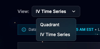
View: IV Time Series
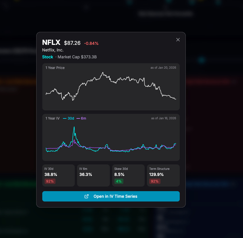
This view allows you to load any US-listed stock, ETF, or US index ticker and explore advanced charts of the implied volatility surface. Here’s an example with NFLX (Netflix):
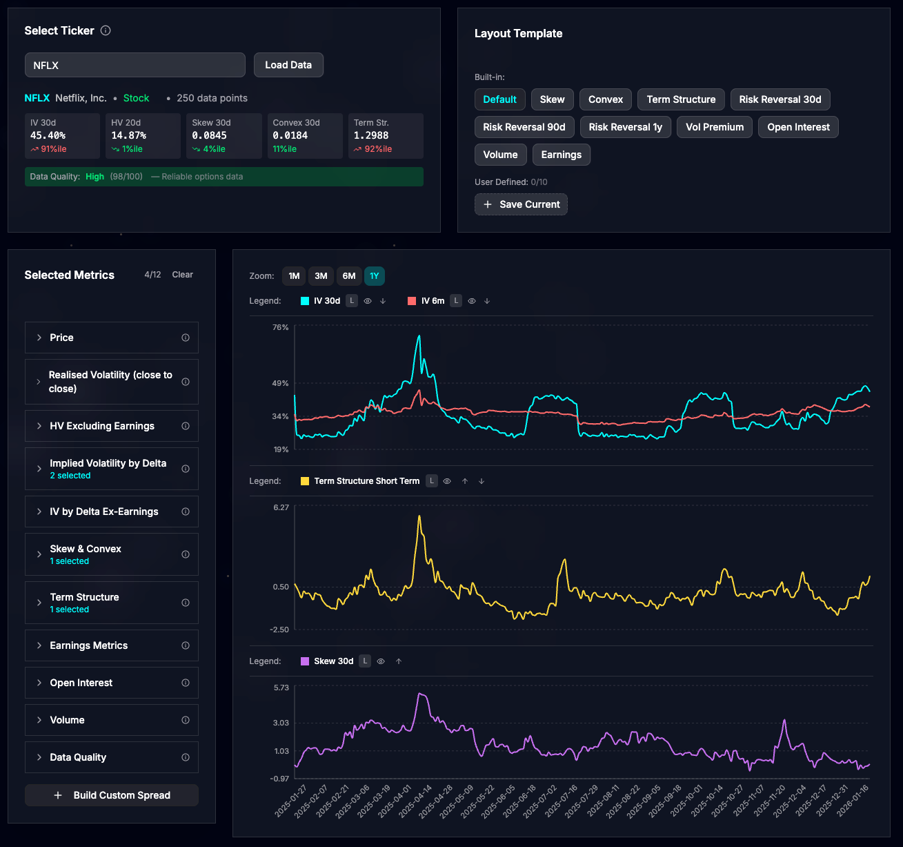
The default layout displays three key charts:
ATMF Implied Volatility (30 days and 6 months): This represents the IV for at-the-money-forward (ATMF) options with a delta of 50%.
Term Structure Short Term: A measure of the term structure’s steepness. A high positive value signals backwardation—where short-term IV exceeds medium-term IV—often indicating market stress or an anticipated event.
Skew 30 days: This gauges how expensive one-month puts are relative to one-month calls. Higher values suggest traders are seeking downside protection through put buying.
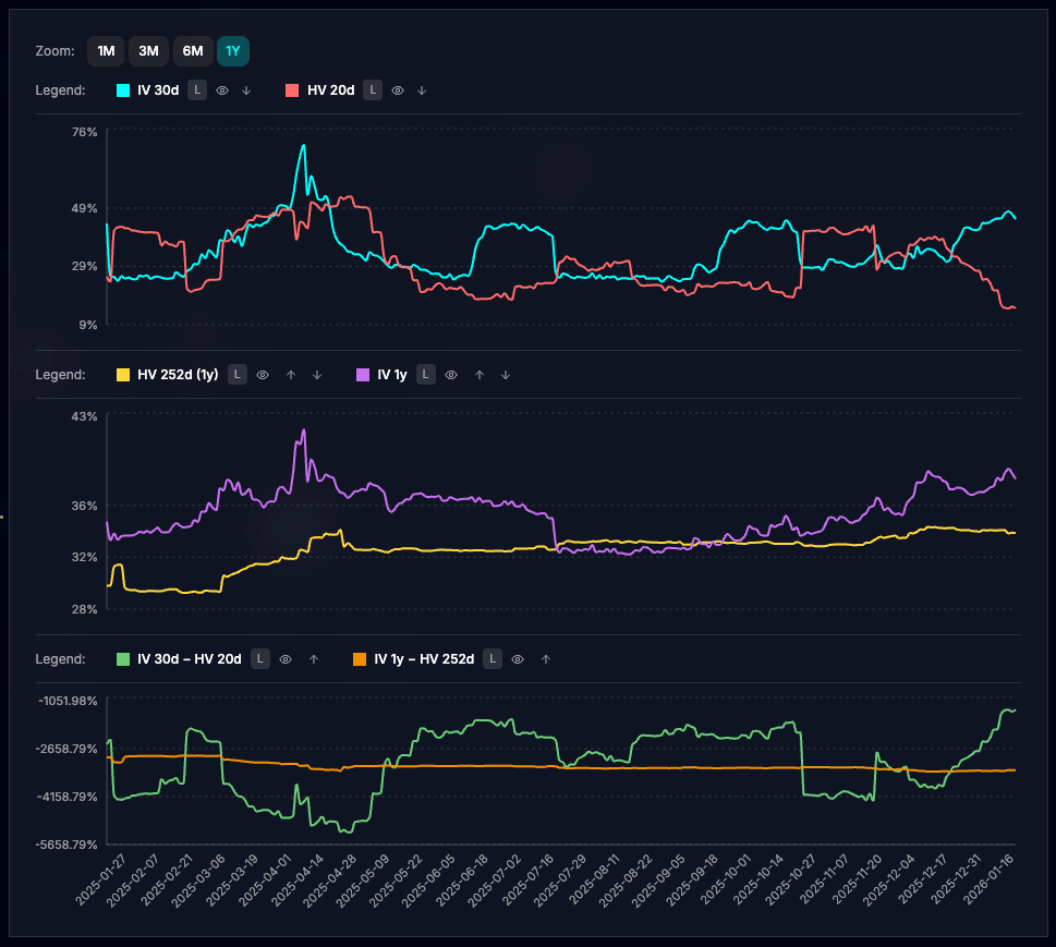
I’ve included several built-in layouts curated by myself as excellent starting points for analyzing stocks or ETFs. For instance, the “Vol Premium” layout highlights the gap between realized and implied volatility:
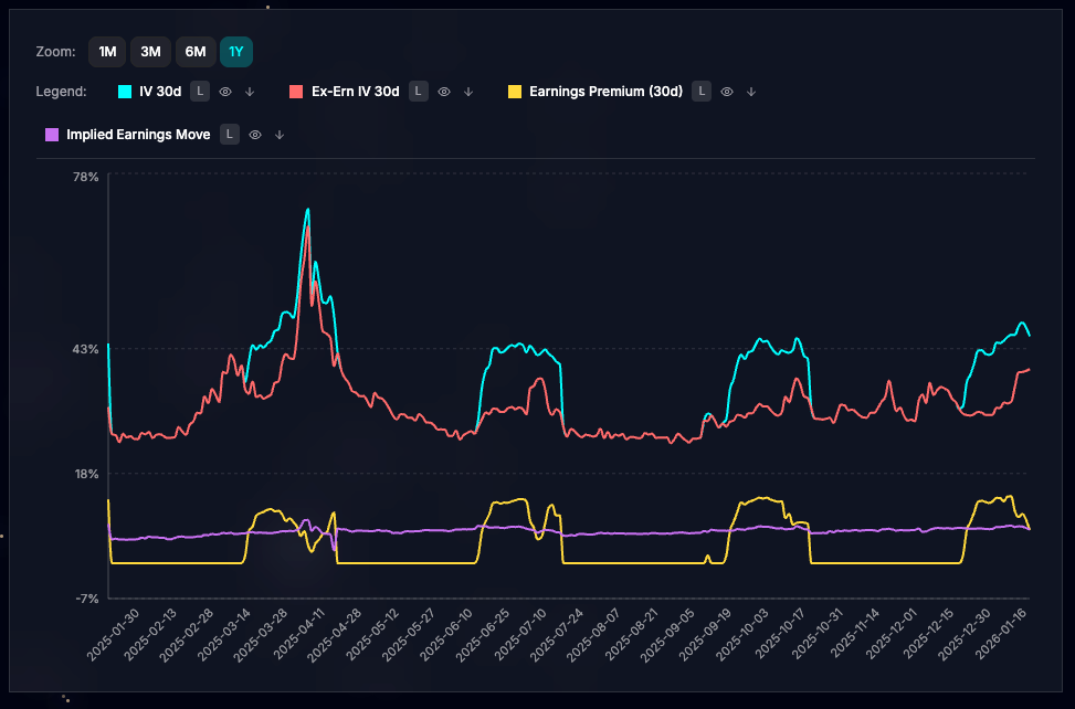
For earnings plays, there’s a specialized view showing how upcoming earnings announcements influence IV levels.
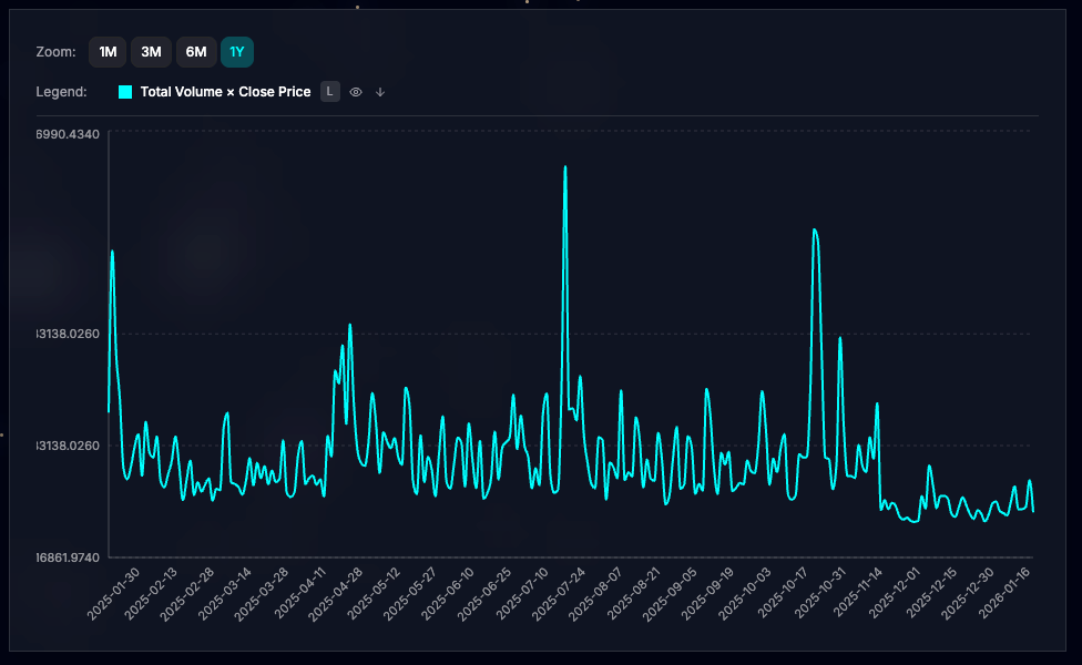
Take your analysis further with the Build Custom Spread feature, which lets you add, subtract, divide, or multiply any metrics. In this example, I’ve created a custom spread to chart total daily options notional: total options volume × closing price (unadjusted).
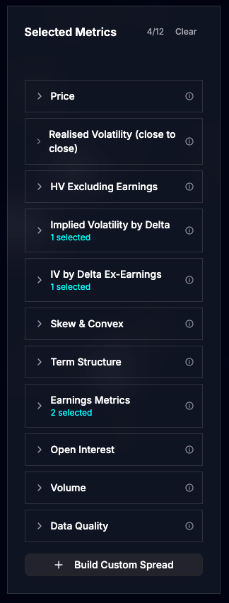
The tool boasts an extensive library of metrics, hover over the info tooltip for detailed explanations on each one.
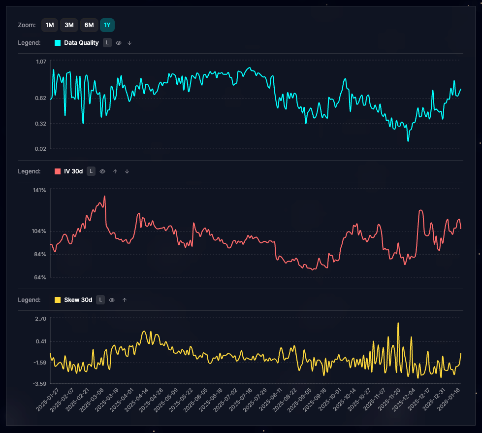
Keep in mind that options liquidity varies by stock. The “Data Quality” metric provides a confidence score for IV calculations. While ATMF IV (e.g., 30 days) remains reliable even at lower quality levels, metrics involving out-of-the-money (OTM) options may require caution. See this example with RDW, where liquidity dropped in December, making the Skew 30d (yellow line in the bottom panel) notably noisy:
View: Quadrant
Shift to scanning mode with the Quadrant view, ideal for spotting opportunities across the options market. It’s structured into three sections.
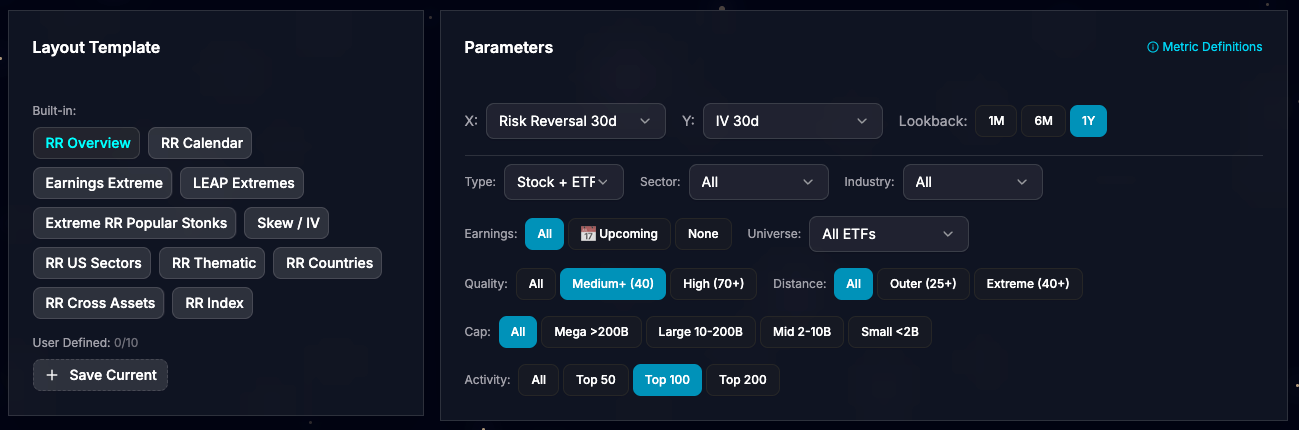
Layout Template & Parameters: Select a pre-built template or design your own using dual axes with normalized IV metrics. In the “RR Overview” example, the Y-axis plots IV 30d, while the X-axis shows Risk Reversal 30d (the IV difference between 25-delta calls and puts). Both are normalized with a one year lookback percentile rank. Higher Risk Reversal values indicate bullish sentiment (opposite of skew metric seen earlier).
The quadrant plots up to 200 points based on your filters.
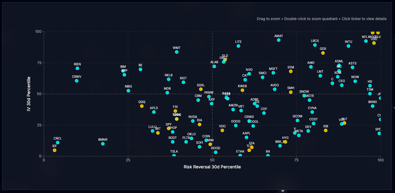
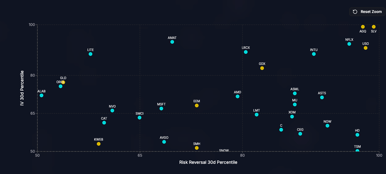
Interact easily: Zoom in by drawing a rectangle with your mouse (left-click and drag) or double-click a quadrant to focus on it. Below, I’ve zoomed into the upper-right quadrant, revealing stocks and ETFs where traders are bullish and willing to pay up for upside IV. As of the latest close, SLV (Silver ETF) leads, followed by AGQ (2x leveraged Silver ETF), USO (Oil ETF), and NFLX (a potential pre-earnings dip buy).
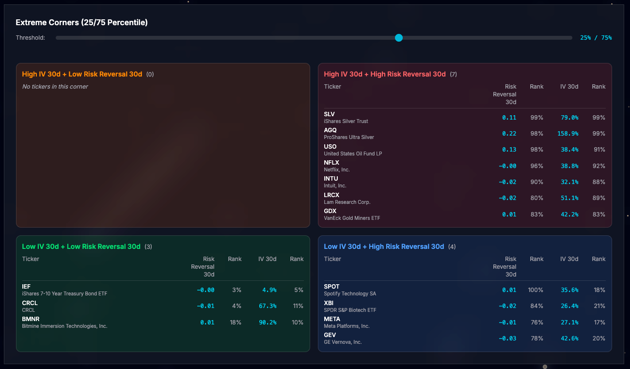
The Extreme Corners section highlights the most outlier points in each quadrant. Convenient when browsing the web app from your iphone where the quadrant chart becomes inconvenient.
Click any ticker in the chart or table to open a quick stock overview, complete with a link to jump straight to IV Time Series for deeper dives.
Iv’ve also added a new widget to the homepage, showcasing the four most extreme tickers per quadrant for at-a-glance insights:
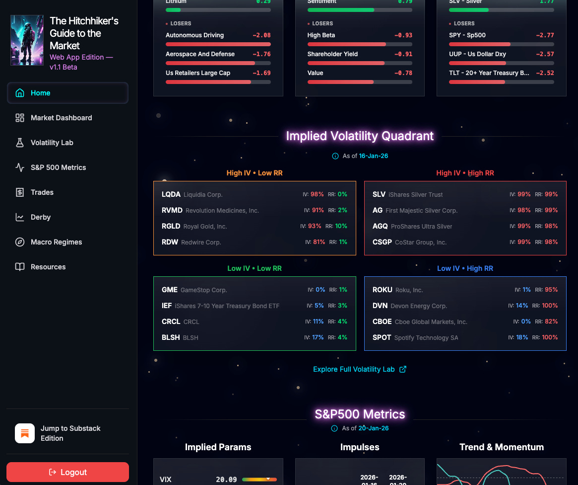
Key Note: IV data updates daily at 12:00 AM Eastern Time. Always verify the latest timestamp in the widget or at the top of the Volatility Lab page.
Misc updates
Beyond Volatility Lab, I’ve made these enhancements:
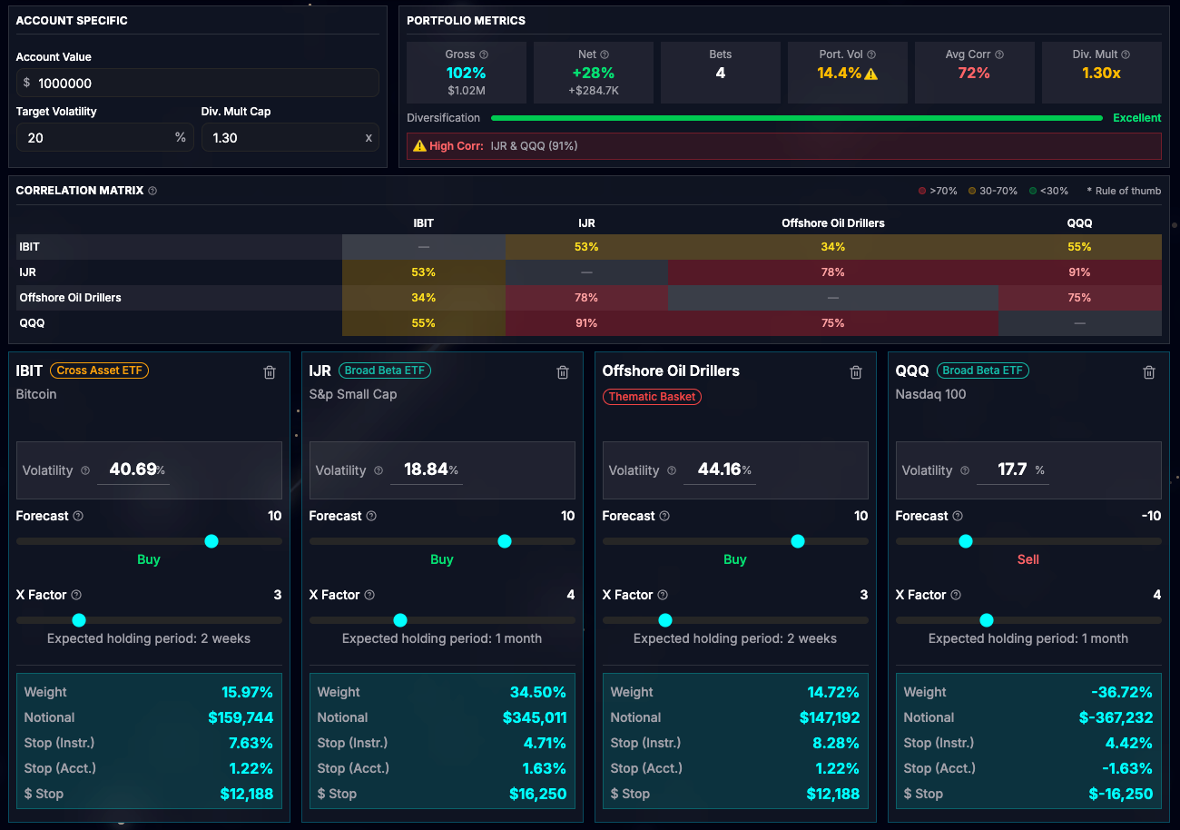
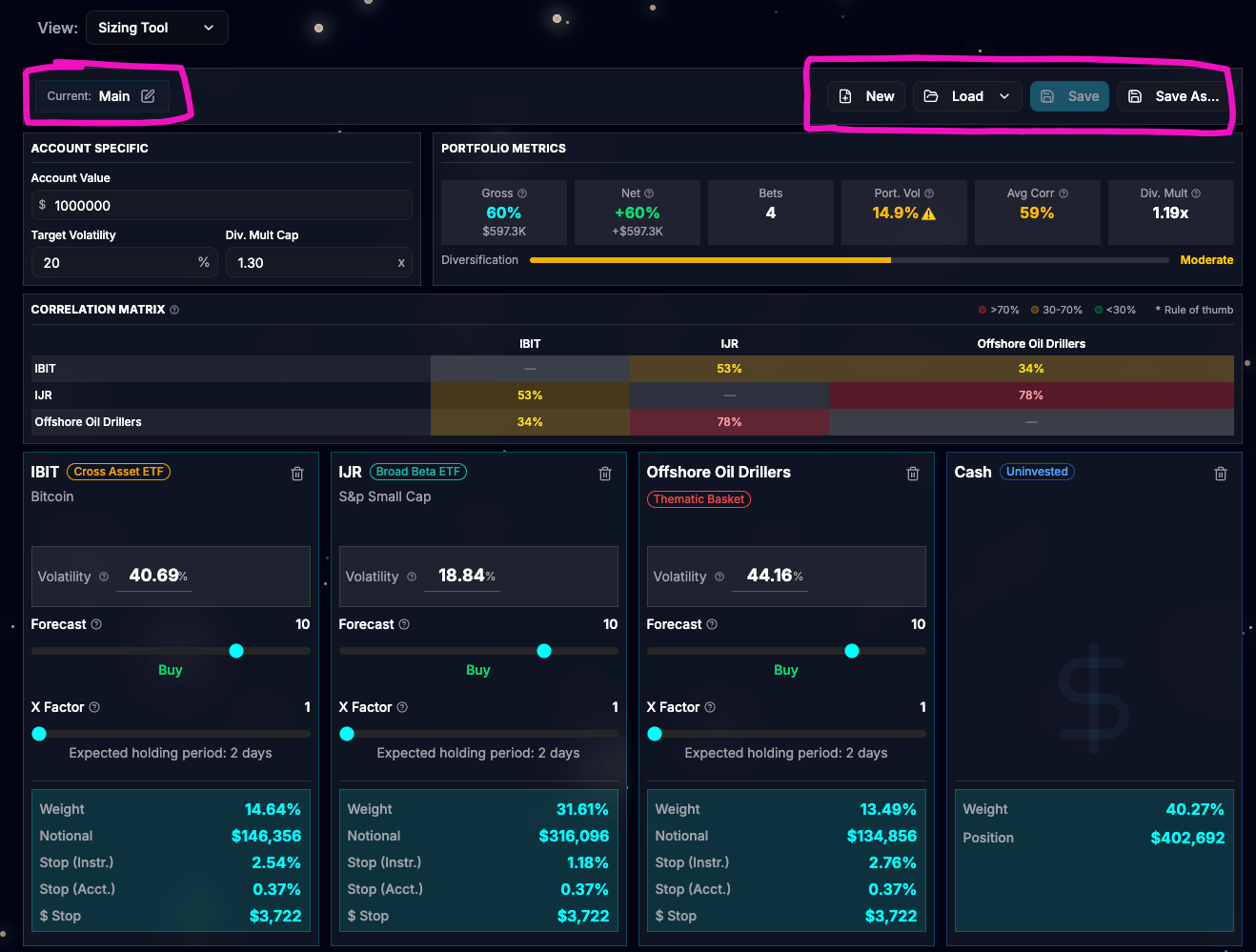
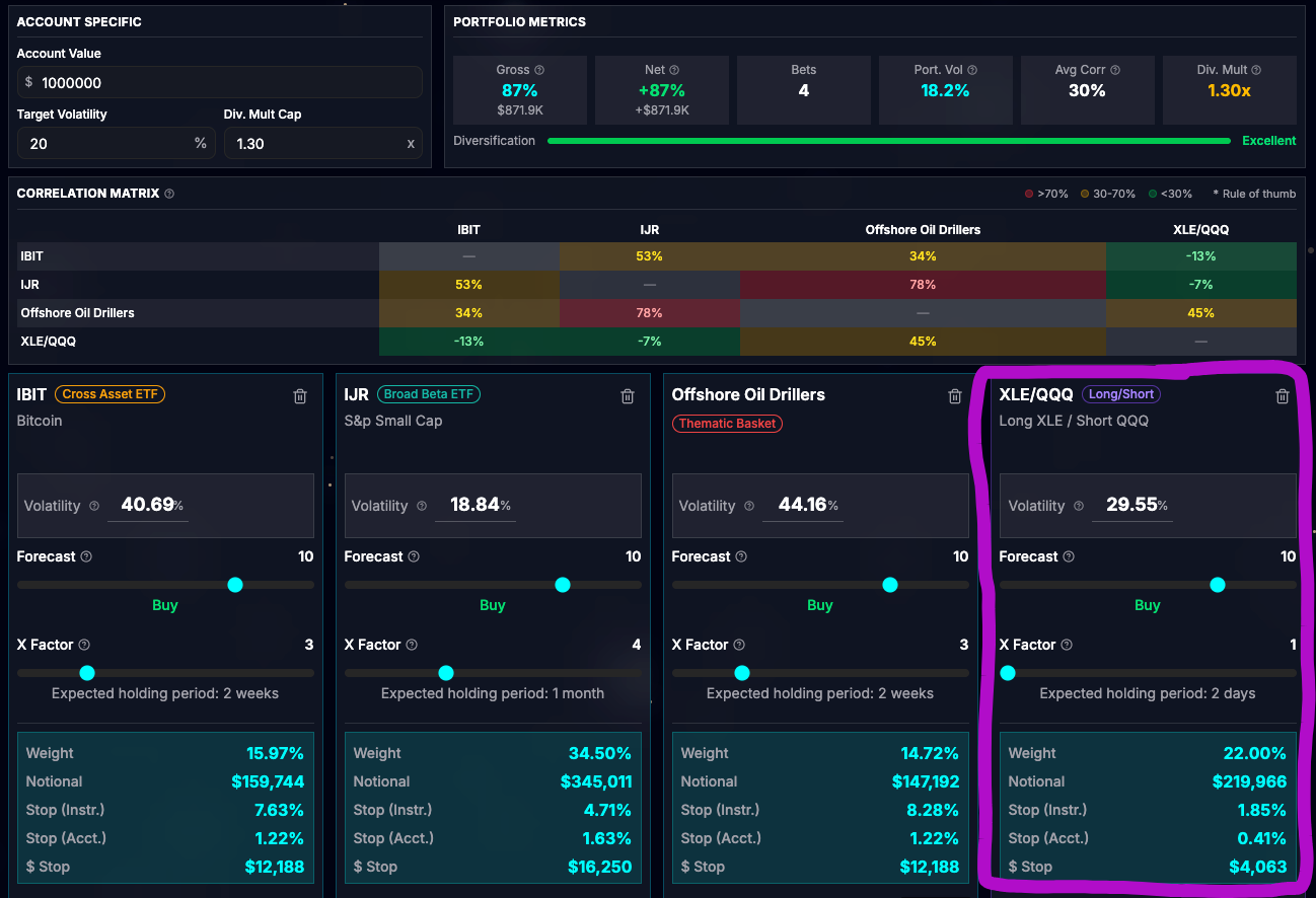
Sizing tool: It is now possible to save bets as a portfolio. Each user can create up to 10 portfolios.

Sizing tool: A negative forecast was interfering with the Div Multiplier, leaving it at a conservative value. This is now fixed. For example, you can use a negative forecast for hedging part of the portfolio.
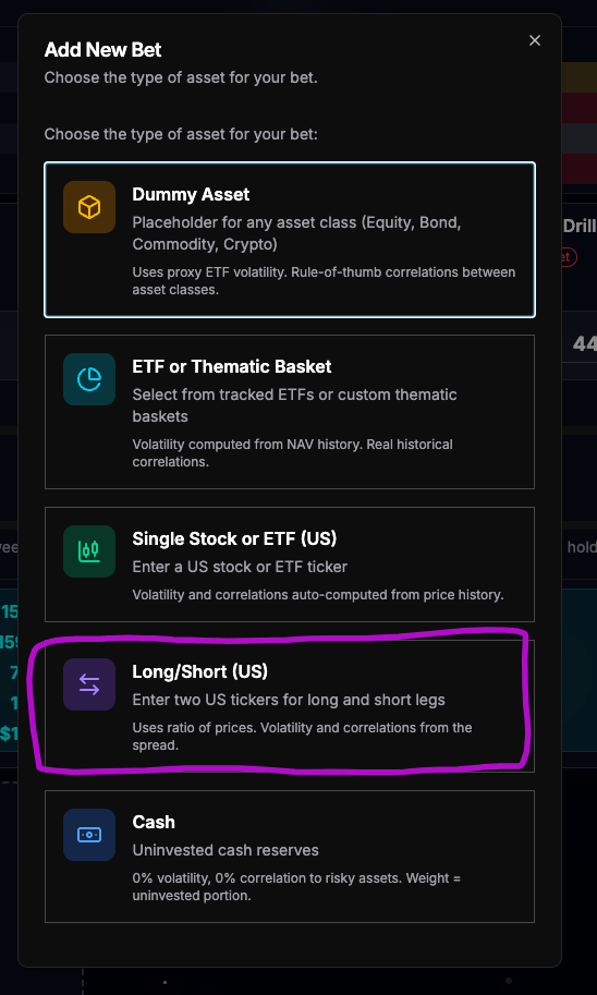
Sizing tool: You can now have a long/short position as a bet. Just enter two tickers: one for the long position and one for the short.

User Session: updated from 24hours to 7days.
I hope these updates improve your trading experience! If you spot any bugs or have feedback, message me directly.